Graphic design and the different types of design?

In today’s digital era, graphic design in Tunisia plays a central role in shaping brand identity, improving communication, and enhancing user experience. More than just visuals, graphic design is a strategic tool that combines creativity, technology, and psychology to deliver impactful messages. At Elly Agency, a leading graphic design agency in Tunisia, our team of creative professionals helps businesses build strong visual identities through tailored graphic solutions.
What is Graphic Design?
Graphic design services are about creating visual content that communicates messages effectively. It combines typography, imagery, colors, and layouts to produce designs that inspire, inform, or persuade an audience. From branding and visual identity in Tunisia to digital marketing design, graphic design is the backbone of any successful communication strategy.
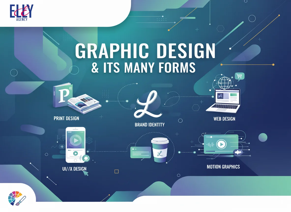
The Different Types of Graphic Design
1. Branding and Visual Identity
Branding is at the heart of graphic design. Our professional graphic designers in Tunisia create logos, color palettes, typography, and brand guidelines that define how a company is perceived. A strong brand identity ensures consistency across all communication channels.
2. Marketing and Advertising Design
Marketing design focuses on visuals for campaigns, both online and offline. This includes flyers, brochures, posters, social media graphics, and banners designed to capture attention and drive engagement. At Elly Agency, we specialize in creative design services in Tunisia that deliver results.
3. Web and Digital Design
Web and graphic design in Tunisia are essential for building strong online visibility. Our team develops website layouts, mobile apps, and UI/UX design that ensure user-friendly and visually appealing digital experiences, perfectly aligned with your brand identity.
4. Print and Packaging Design
Despite the digital shift, print design remains vital for many businesses. From business cards and packaging to catalogs and magazines, Elly Agency provides print and packaging design in Tunisia to strengthen your brand’s physical presence.
5. Motion Graphics and Animation
Motion graphics in Tunisia are becoming increasingly important for brands looking to stand out. From explainer videos to animated ads, we create dynamic content that engages audiences and enhances your digital campaigns.
6. Environmental and Space Design
This type of design connects people to physical spaces with visuals such as signage, exhibition stands, and branded environments. It’s a powerful way to reinforce your visual communication strategy in both professional and public spaces.

Why Choose Elly Agency for Graphic Design in Tunisia?
At Elly Agency, we combine creativity with strategy to deliver impactful designs. As one of the best graphic design agencies in Tunisia, we offer:
Custom branding and logo design services.
Digital and web design tailored for businesses.
Affordable graphic design solutions in Tunisia.
A team of experienced designers with international vision.


